Successful yoga teachers leverage their website to reach more people in their niche.
While creating a your website is a crucial first step, knowing how to ensure your website is working for you is the secret sauce behind successful websites.
If you’ve been with us on this journey for a while, you’ve (hopefully) already created your website, but if not be sure to download our step-by-step guide to creating a yoga website.
After you create your website, the next step is to improve your website to ensure it’s engaging so your visitors stick around long enough to feel connected with you and ultimately join your email list.
In order to have a truly effective website, you need following pages (at a minimum):
- Homepage
- About me page
- Contact me page
- Blog
- Teaching Schedule (or Offerings) page
Each of these pages should be on your “main menu” at the top of your website – this will make it easier for your readers to find what they were looking fo.
I’ll go into greater detail with each of these pages so that you understand why each page is important, and how to optimize it for greater engagement from your readers.
Great engagement = more successful business. 🙂
Why Even Care About Specific Webpages?
Before I launch into the 5 webpages every yoga teacher needs on their website, I’d like to share why it’s even important to care about specific webpages in the first place.
A great webpage will help you form connection with your readers which increases conversion rates. Conversion rates are the percentage of readers who take your desired action. Desired actions might include: join your email list, comment on the article, signup for your workshop, etc.
Last week I published how to build an email list with a free gift. Offering something for free in exchange for joining your email list is a great way to increase your “conversion rate.”
The higher your conversion rate, the more potential students/clients you will have!
Therefore, it’s important to strategically build each page on your site. Your overall strategy should be to add value, build trust, form a connection, and lead your reader towards your desired action (join email list, etc).
To go a step further, every page should answer these two questions:
Free download: 100 Niche Ideas for Yoga Teachers
Download now- What is the reader looking for?
- What do I want the reader to do?
What is the reader looking for?
Your readers are clicking on specific pages to learn specific things. You wouldn’t want your teaching schedule listed on your “contact me” page, would you?
The focus of each page should be clearly delivered on that page. Keep in mind that less is (generally) more. You don’t want to risk losing their attention, so keep it concise and to the point. Giving them less to digest will make it easier for them to remember your content, and do what you want them to do.
What do I want the reader to do? (call-to-action)
Each page should have a goal – what do I want the reader to do after reading this page? This is also known as your CTA (call-to-action). Every single page must have a CTA.
For example: We’ll use your “About Me” page. After your reader learns about your story and what type of yoga you offer, your goal (or call to action) would be for that reader to join your email list so they an continue learning from you!
Other examples of Call to Actions (CTA) include:
- Download your free gift (also adds them to your email list)
- Follow you on social media
- Comment on that blog post
- Schedule a free 1×1 consult
- Share your content with a friend
Alright lets dive into each of the 5 important pages!
Free download: 25 Ways Yoga Teachers can Earn More Money
Download now1) Homepage
Your first impression…the pressure is on!
Your homepage is the most important page on your website. Consider it the virtual front door to you and your business. It should captivate your audience and make them want to explore more. This is your first chance to make a good impression on your true OMies.
Be sure to put your face on your home page! However, avoid advanced yoga postures here as it might alienate some students).
Because it gets the most traffic on your site, you should spend the most time and effort to ensure your homepage is incredible. Your homepage must include a headline that clearly explains what your site has to offer. If this isn’t clearly communicated within 3 seconds, you risk losing your visitor right then and there.
You want your homepage to convey two important things:
- WHO this website is for (aka your niche)
- WHAT BENEFITS your readers will receive from your website
It’s also important to make your homepage organized so your readers can find all your assume content easily.
Be sure to highlight your best content and make it very easy for your readers to join your email list.
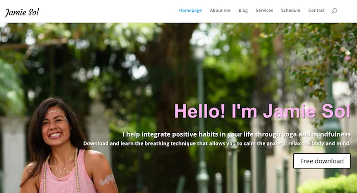
Real life example: Our client Jamie Sol’s homepage is crystal clear. She has her tagline: “I helps integrate positive habits in your life through yoga and mindfulness.” And directly below the tagline is her free gift “Breathing techniques that allow you calm anxiety, relax the body and mind.”
Free Course: Create a Yoga Website You'll Love
(7 steps)
Enroll for Free
About Me
Your About Me page is all about connection. It’s where you share your personal story and have the opportunity to be vulnerable. I encourage you to be you, be real, and share from the heart.
Let your readers know you’ve been in their shoes while giving them a glimpse of the ‘other side.’ You can even lay out some of the basic steps that helped you, and could help them, achieve their dreams. Add in testimonials and social proof here to back up your expertise.
Include your full name, headshot, and your credentials. This is your opportunity to position yourself as the expert in your niche. Give some information about your values and motivations and how you got to where you are today.
Pro-tip: About Me pages are statically the highest converted pages on your website. This means, you should definitely have a way for your readers to join your email list – preferably with a free gift attached.
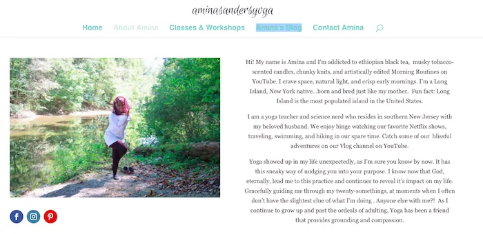
Real life example: We love our client Amina Sanders’ About Me page. She is very real, has great images, and social media icons easily accessible. She also has a couple options to join her email list.
Blog
On your website exists a very important page called your Blog. A few weeks back we explained the importance of a blog on your yoga teacher website.
Learn to Create a Website for Your Yoga Business
Enroll for FreeYour blog will be the place you share all sorts of knowledge and information with your readers. It’s where you start to build trust by teaching something, helping overcome challenges, or related on a deeper level.
With each blog post you are providing value for free and slowly with time will build the trust of your fans.
Of course each of your blog posts should have a lead magnet inside, so that you can continue building your email list.
Learn more: 3 Reasons Why Every Yoga Teacher Needs a Newsletter
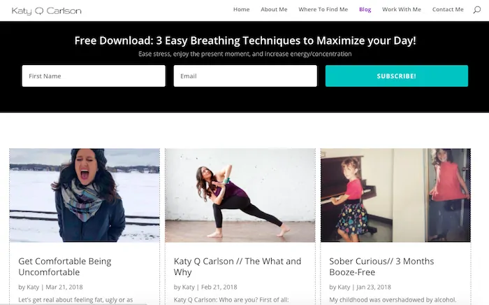
Real life example: We love our client Katy Carlson’s Blog page. It’s super clean, her images are fitting, and she has a really nice email optin form right above the blog posts. Just looking at it makes me want to click her teal button. 😉
Schedule / Offerings
Depending where you are in your teaching journey, this page could be called either “Schedule” or “Offerings.”
If you’re only offering public yoga classes, you can call this page “Schedule.” If you have a consistent teaching schedule, be sure to post it on your website with links to each studio. All too often we see websites where the teacher doesn’t list their schedule!
If you offer multiple services, then you can title this page something like “Offerings.” Here you can include all the services and things you offer. Workshops, trainings, essential oil consultations, private yoga lessons, astrology readings, etc.
Keep this section up to date and link to the studios and/or include specific studio locations.
Protip: Any page where you’re asking someone to sign-up for something should include testimonials. When your potential clients are considering joining one of your program, social proof (testimonials, etc.) will help ease their worries.
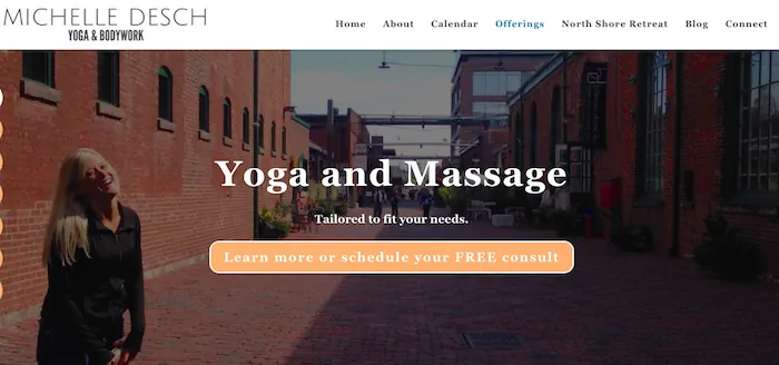
Real life example: We love our client Michelle’s offering page. Not only is the design top notch, but I love her call-to-action right on the top. If you click through to her page and scroll down, the page gets even better! She has great testimonials and FAQs.
Contact Me
Your OMies need a way to contact you! You want this to be as easy for them to do as possible. Link to your social platforms and if you feel comfortable, your business email address. You may also choose to have a “contact form,” in which the reader fills out their information and a brief message that gets sent directly to your email inbox.
Include a photo of yourself to make it a bit more personal. 🙂
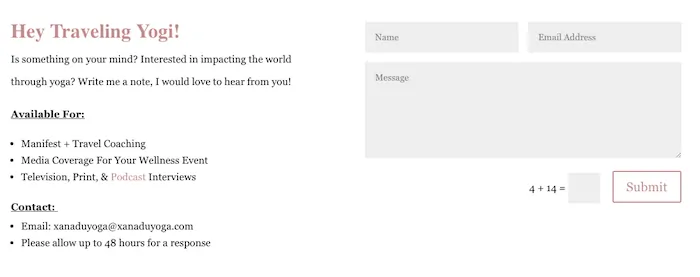
Real life example: We love our client Brytta’s contact me page. The design is clean and simple. And she mentions “what she is available for” which gives options for readers and potential partnerships. She also provides two options for contacting her (email address or contact form). Below she embeds her Instagram feed, where she is very active.
Let’s Wrap Up!
Remember, be strategic when you’re creating your webpages – each page should have a goal in mind (call-to-action). Keep in mind the questions, what is the reader looking for and what do I want the reader to do?
Don’t forget to be yourself! The more value and you-ness’ you can provide, the more your audience will trust you, building important relationships over time.
Questions, comments, concerns?
Let me know what’s on your mind.
Curious about how we help our clients create beautiful websites like the examples above?
Drop me a line here or at theyoganomads@gmail.com
Until next time,
Anne

